Why flat backgrounds are starting to feel dead
Digital design spent years becoming cleaner and easier to generate. Now the pendulum is moving toward atmosphere, texture, dimensionality, and visible creative intention. Here is how authentic light fields transform posters, album artwork, campaigns, and web interfaces.
Ger'Quia Abner
Founder & Design Engineer · TAGDESIGNS
Digital design spent the last decade perfecting the art of looking finished. Software got faster, rendering engines got sharper, and design systems compressed the technical distance between a blank canvas and a competent layout.
That efficiency solved an old problem and created a new one: almost everything looks finished in exactly the same way.
When templates, generic gradients, default gaussian blurs, and synthetic image generators make clean surfaces effortless, clean surfaces stop being impressive. A flat background with a three-stop linear gradient no longer signals minimalism. It signals that nobody had a strong opinion about what should happen behind the content.
We are watching a clear pendulum shift across contemporary graphic design, album packaging, web design, and creative direction. The reaction to synthetic sameness is not noise or clutter—it is atmosphere, optical depth, and visible creative authorship.

// FIG. 01Atmosphere treated as an active compositional layer rather than decorative wallpaper.
3072 × 4096 4K LOSSLESS PNG01. Flat Isn't the Problem. Generic Is.
Let's be precise about what is actually broken. This is not an argument against minimalism, nor is it an endorsement of chaotic skeuomorphism. A pure solid black background can be magnificent when the typography carries enough architectural tension. A stark, brutalist layout with zero background texture can be brilliant when the structural geometry is deliberate.
The problem begins when the background contributes nothing to the idea except filling the viewport.
In commercial graphic design, poster design, and digital art direction, the background is responsible for establishing five critical forces:
- ■Perceived Depth: Giving the foreground elements something tangible to sit in front of.
- ■Temperature & Emotion: Dictating whether an image feels warm, nocturnal, sterile, or electric before the reader parses the headline.
- ■Focal Guidance: Using light falloff to naturally pull the viewer's eye toward the primary message without heavy drop shadows.
- ■Visual Tension: Providing subtle micro-contrast that allows white typography to stay crisp without feeling detached.
- ■Authorship: Proving that a human designer calibrated the mood for this specific message.
When you default to a flat hex code or an unconsidered gradient, you forfeit all five advantages. The surface remains inert. The composition is forced to rely entirely on type weight or foreground photography to do the emotional heavy lifting.
“When technical polish becomes abundant, recognizable taste becomes scarce.”
02. Why Texture and Materiality Are Returning
Industry forecasts for 2026 across typography, digital art direction, and brand systems all point toward the same underlying hunger: sensory texture, tactile design, and cinematic storytelling.
Why is this happening now? Because the economic value of generic polish has collapsed.
Five years ago, producing a photorealistic render or a smooth, artifact-free gradient required specialized technical skill. Today, automated generative tools can spit out infinite variations of generic smoothness in seconds. The consequence is immediate: when flawless polish becomes free, it stops carrying prestige.
What carries prestige now is authored imperfection—the optical grain of light interacting with a lens, the unpredictable chromatic aberration of an anamorphic edge, and color palettes that feel invented rather than sampled from a default color picker.
Whether designing high-converting SaaS interfaces like our work on Aura Revenue, editorial identities like Luxura, or experimental posters, the background must feel authored.

// FIG. 02The forty-eight distinct light fields in the collection—spanning nocturnal indigos, warm tungsten flares, and deep prismatic spectrums.
CONTACT PREVIEW · 48 SOURCE FILES03. Light Is More Than a Glow Effect
Many designers confuse atmospheric light with a decorative Photoshop glow. They place a radial gradient behind a subject, set the blend mode to Screen, drop the opacity to 40%, and wonder why it looks like a cheap web banner from 2014.
A decorative glow is static and isotropic—it radiates equally in all directions, creating an artificial circle that flattens the canvas.
A cinematic light field behaves like physical optics:
- ■Non-Linear Falloff: Real light does not decay in a smooth mathematical line. It blooms intensely at the source, stretches across the midtones, and dissolves unpredictably into shadow.
- ■Chromatic Dispersion: Light passing through glass splits into subtle secondary hues along the fringe—warm tungsten shifts into soft magenta; electric cyan bleeds into deep indigo.
- ■Directional Vector: An authentic light texture carries an implicit angle. It pushes the eye from top-right to bottom-left, creating an invisible diagonal axis that anchors headlines and CTAs.
When you use authentic 48 cinematic 4K PNG light fields, you are not adding decoration. You are establishing an invisible lighting environment for your layout.
// PRACTITIONER TECHNIQUE
When placing typography over an intense light field, do not add a heavy drop shadow to make the text legible. Instead, use a subtle Curves adjustment clipped to the text layer to slightly boost contrast, or place a 15% opacity solid tone masked only behind the counter-spaces of the letterforms. The type will stay razor-sharp while remaining embedded inside the light.
04. The Same Field Across Four Distinct Mediums
One of the biggest misconceptions about design assets and texture packs is that they force every design to look identical. If a texture is too literal—like a concrete wall or a paper fold—it stamps its fingerprint on everything it touches.
A true light field is an abstract visual instrument. Depending on how you scale, crop, rotate, and blend it, a single 4K source file can yield radically different visual outcomes across posters, album artwork, brand campaigns, and web user interfaces.

// FIG. 03POSTER APPLICATION: The light field provides structural tension that holds stark typography without competing for legibility.
POSTER SCALE · DIRECT 4K CROPPING1. Editorial Posters & Print
In large-format poster design, a flat background leaves huge negative spaces feeling empty rather than intentional. By scaling a light field across a 24×36 inch canvas, the subtle falloff provides visual weight that allows ultra-minimalist Swiss typography to dominate without the composition feeling bare.

// FIG. 04ALBUM WORLD: Setting emotional temperature across streaming covers, vinyl packaging, and motion billboards.
MUSIC ARTWORK · RGB COLOR SPACE2. Album Covers & Music Packaging
Music artwork requires instantaneous emotional transmission at 3000×3000px on vinyl and 50×50px in streaming feeds. Light textures allow musicians and art directors to establish nocturnal mystery, euphoric energy, or cinematic mood in a single square frame without resorting to generic 3D figures or stock photography clichés.

// FIG. 05DIGITAL INTERFACE: Ambient lighting gives the product hero physical presence before the interface interactive elements enter the viewport.
WEB HERO · 0.18 OPACITY MULTIPLY/SCREEN3. Web Design & Product Launch Heroes
Modern web design has suffered from the "SaaS hero template" plague: white background, centered H1, violet pill badge, and two buttons. Placing a controlled, low-opacity light texture behind an interface creates depth and environmental mood, transforming a standard web hero into an immersive digital showroom.

// FIG. 06COLOR WORLDS: A controlled range of optical temperatures designed to prevent repetitive visual outcomes.
8 DISTINCT CHROMATIC SPECTRA05. Why I Built Signature Light Fields
For years, whenever our studio worked on branding systems like Purebloom Organics or bespoke digital platforms, we ran into the same frustrating bottleneck when sourcing background textures:
- ■Stock photo libraries offered cheesy 1990s lens flares or blown-out neon streaks.
- ■Modern asset marketplaces were flooded with low-resolution AI-generated hallucinations that disintegrated into blurry pixel artifacts when zoomed to 100%.
- ■Existing gradient packs were flat 8-bit files with visible color banding.
I needed an asset library that met the standards of our own studio: high-resolution lossless PNGs (3072 × 4096), rich optical depth, and zero AI generation.
No AI-generated imagery. Every field was developed through original procedural experimentation, custom distortion and lighting systems, color work, compositing, and manual art direction. We iterated through hundreds of variations, discarding anything that felt like a generic stock effect, until 48 distinct, reusable field instruments remained.
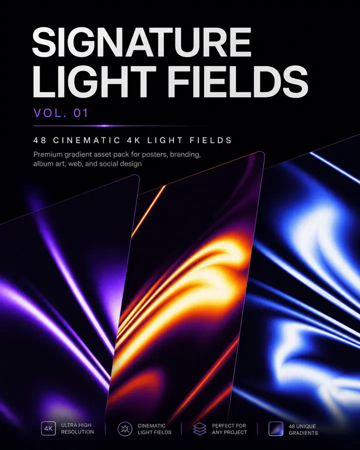
// FIELD TOOL 01 · TRANSACTIONAL ASSET
SIGNATURE LIGHT FIELDS VOL. 01
48 original cinematic 4K PNG fields built for posters, album artwork, campaigns, web heroes, and experimental compositions.
06. How to Use Light Textures in Production
To get the most out of high-resolution PNG light textures in Photoshop, Figma, or Illustrator, treat them as compositional instruments rather than simple overlays:
1. Master Your Blending Modes
- ■Screen / Lighten: The gold standard for dark compositions. Black pixels vanish completely, leaving only the pure luminescence of the light field interacting with underlying artwork.
- ■Color Dodge / Linear Dodge: Use at low opacities (15% to 30%) to create explosive, high-energy highlights where light strikes metallic or glossy surfaces.
- ■Overlay / Soft Light: Ideal for daytime or lighter compositions. Adds rich chromatic saturation and subtle contrast without washing out fine details.
2. Crop Aggressively for Infinite Variations
Never assume you have to use a 4K texture centered on your canvas. A single 3072×4096 asset contains dozens of micro-compositions:
- ■Zoom in 300% on the top-left corner to capture a subtle, atmospheric dust bloom.
- ■Rotate 90 degrees and stretch horizontally to create a panoramic website footer horizon.
- ■Invert the color map (
Cmd + I) to transform warm tungsten flames into otherworldly electric cyan fields.
3. Layer Masks Over Global Opacity
Amateurs lower the master layer opacity. Professionals paint with layer masks. Use a soft 0% hardness brush with 20% flow to selectively mask out light from areas where high-density body copy needs undisturbed contrast.
07. When NOT to Use Light Textures
A design technique becomes truly powerful only when you know when to withhold it. Adding atmospheric texture to every project is just as lazy as leaving every background flat.
Do not use light textures when:
- ■The Typography Already Carries the Tension: If you are running an 80pt condensed grotesque headline across 90% of the canvas with tight negative tracking, adding a dramatic light streak creates visual noise that fights the letterforms.
- ■Clinical Precision Is Required: In medical apps, financial ledger tables, or technical dashboards, visual atmosphere distracts from data comprehension.
- ■The Texture Becomes More Memorable Than the Brand: If a client looks at a campaign and remembers the purple glow instead of the product being sold, the art direction failed.
Restraint is what separates a world-class creative director from an effect chaser.
08. The Real Shift: From Effects to Systems
The future of digital design is not about collecting more Photoshop actions or chasing the newest viral filter. It is about building reusable visual systems that allow individual designers and small studios to execute at the speed of large agency teams while maintaining unmistakable authorship.
When you have a foundational library of commercial-use light texture collections, you no longer start projects staring at an empty void. You start with light, atmosphere, and temperature—and build the composition from there.
Explore our full studio philosophy in our services overview, or inspect the Signature Light Fields Vol. 01 package to bring atmospheric depth into your next release.
// KEEP GOING
Further Insights & Analysis
Why every Awwwards site in 2026 is a design-engineering project
The handoff is dead. In 2026 the sites winning Awwwards, FWA, and CSS Design Awards are all built by people who design in the browser and engineer in the design tool. Here is what that actually looks like in production — React, Framer Motion, GSAP, WebGL, and the studio operating model that makes it ship.
The 5-second SaaS headline test (and how to write one that survives)
Most SaaS landing pages lose the visitor in the first five seconds — not because the product is bad, but because the headline is vague. Here is the rubric we built into TasteCourt to score them, and the four-step rewrite that turns a confusing page into a converting one.
AI brand systems in production: the end of the static brand guide
Static brand guides die in the first quarter. In 2026 the studio ships brand systems as living code — design tokens, generative palettes, AI-assisted asset libraries, and component primitives that compile into Figma, Photoshop, and the production website at once. Here is the architecture, the tooling, and the workflow.