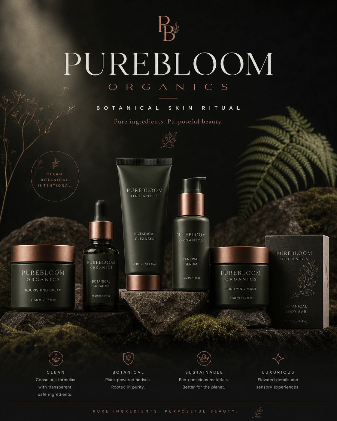
PUREBLOOM
BOTANICAL SKIN RITUAL · 6-SKU PACKAGING SYSTEM · RETAIL TOWER
CLIENT
Purebloom Organics
ROLE
Brand Designer · Art Director
YEAR
2023
CATEGORY
Brand Identity · Packaging · Digital
DELIVERABLES
- — Identity & Monogram
- — Packaging System (6 SKUs)
- — Stationery & Unboxing
- — Social Media Toolkit
- — E-Commerce Direction
- — Retail Display
- — Mobile Commerce
BRIEF
Purebloom Organics needed to launch a premium plant-based skincare line into a category that has confused "natural" with "amateur" for a decade.
The founders had the formulas, the philosophy, and the FSC-certified suppliers. What they didn't have was a visual world: a wordmark, a packaging system, a ritual to perform on a bathroom counter, an Instagram grid, a storefront, an app, and a place on a Sephora-grade endcap. We built all of it from a single thesis — pure ingredients, purposeful beauty — and treated every surface as part of the same ritual.
PROCESS
01 · DIAGNOSE
Audited 40+ clean-beauty brands and found the same five visual moves on repeat: kraft paper, eucalyptus icons, single-weight sans, beige-on-beige. We mapped the white space and chose to enter as the rare botanical brand that reads deep, dark, and editorial — the way a luxury fragrance house treats its category.
02 · DESIGN
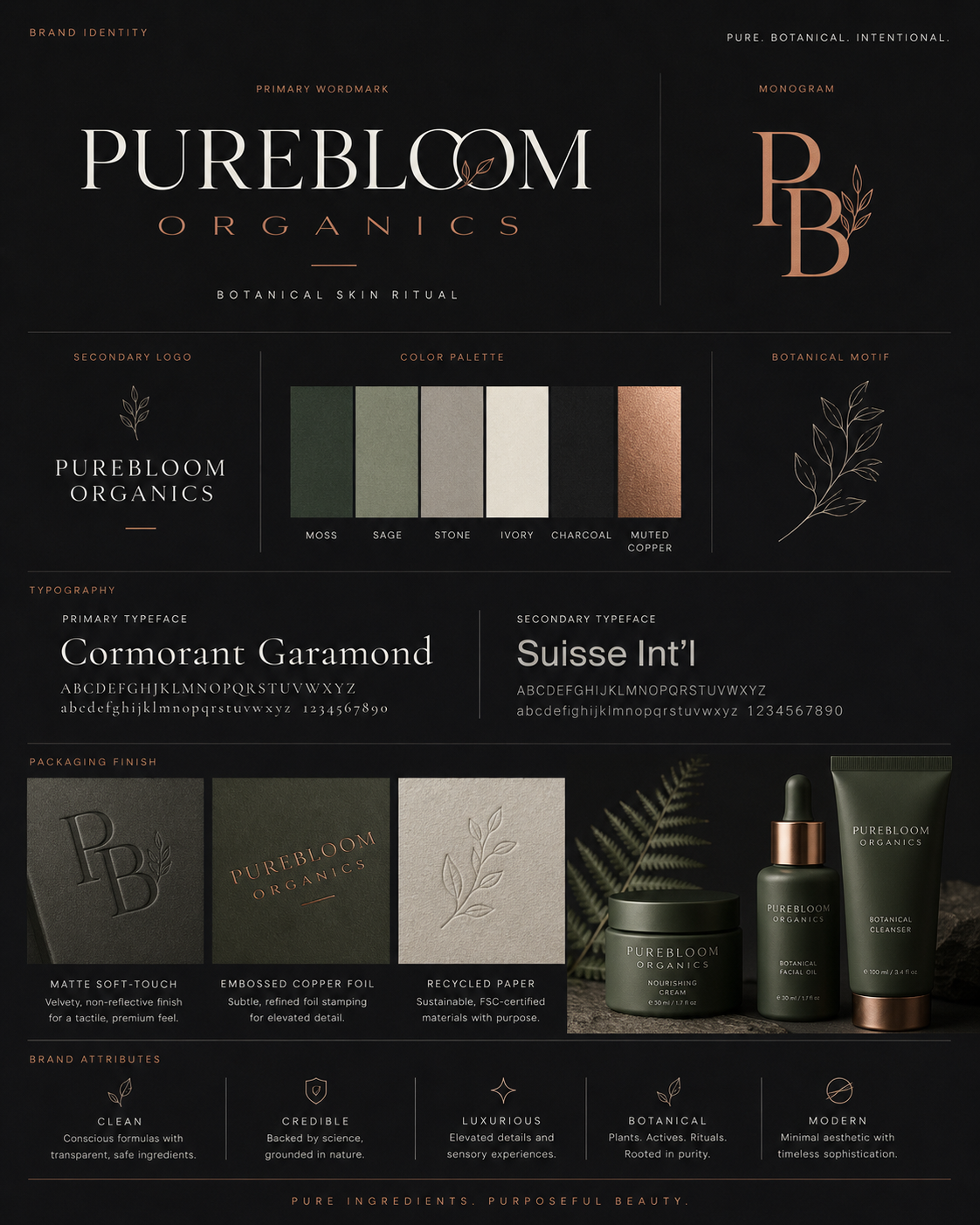
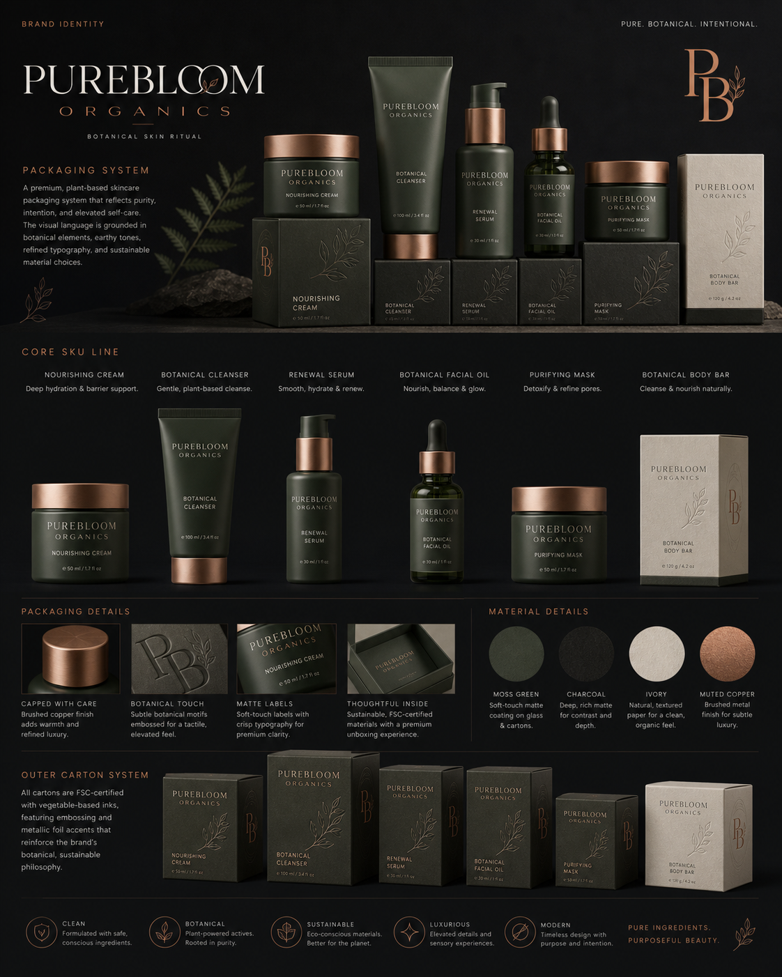
Built a wordmark around a Cormorant Garamond ditto with a botanical ligature inside the second "O", paired with Suisse Int'l for the working voice. A "PB" monogram with a single fern was drawn for closures, foils, wax seals, and any surface where the full mark wouldn't breathe. Six tones — Moss, Sage, Stone, Ivory, Charcoal, Muted Copper — were tuned to read both as packaging and as a digital UI.
03 · DEPLOY
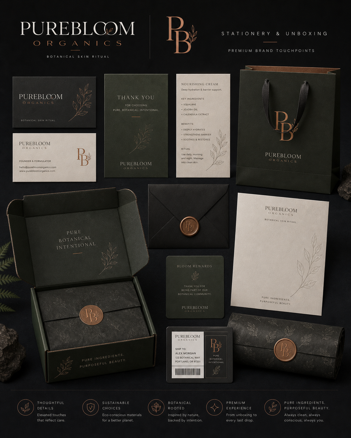
Specified six SKUs with a single packaging architecture (matte soft-touch coating, embossed copper foil, FSC-certified recycled outer cartons), a stationery and unboxing kit with a wax-sealed envelope and "Bloom Rewards" insert, an editorial social toolkit, an e-commerce template with a "Rituals That Work" merchandising shelf, a Sephora-grade retail tower, and a six-screen mobile commerce flow.
VISUAL SYSTEM
The system is built on a deep, low-light palette so every product reads like an object you'd want on display. Copper foil and a single drawn fern do all the warmth. Cormorant carries the brand voice; Suisse Int'l carries the work.
#3F4A36
Moss
#6F7A5C
Sage
#A6A294
Stone
#E9E3D3
Ivory
#1A1A18
Charcoal
#B07A4F
Muted Copper
SIX-TONE SYSTEM · MOSS / SAGE / STONE / IVORY / CHARCOAL / MUTED COPPER
PRIMARY TYPEFACE
Cormorant
VOICE · DISPLAY · WORDMARK
SECONDARY TYPEFACE
Suisse Int'l
WORK · UI · BODY
SOCIAL TOOLKIT
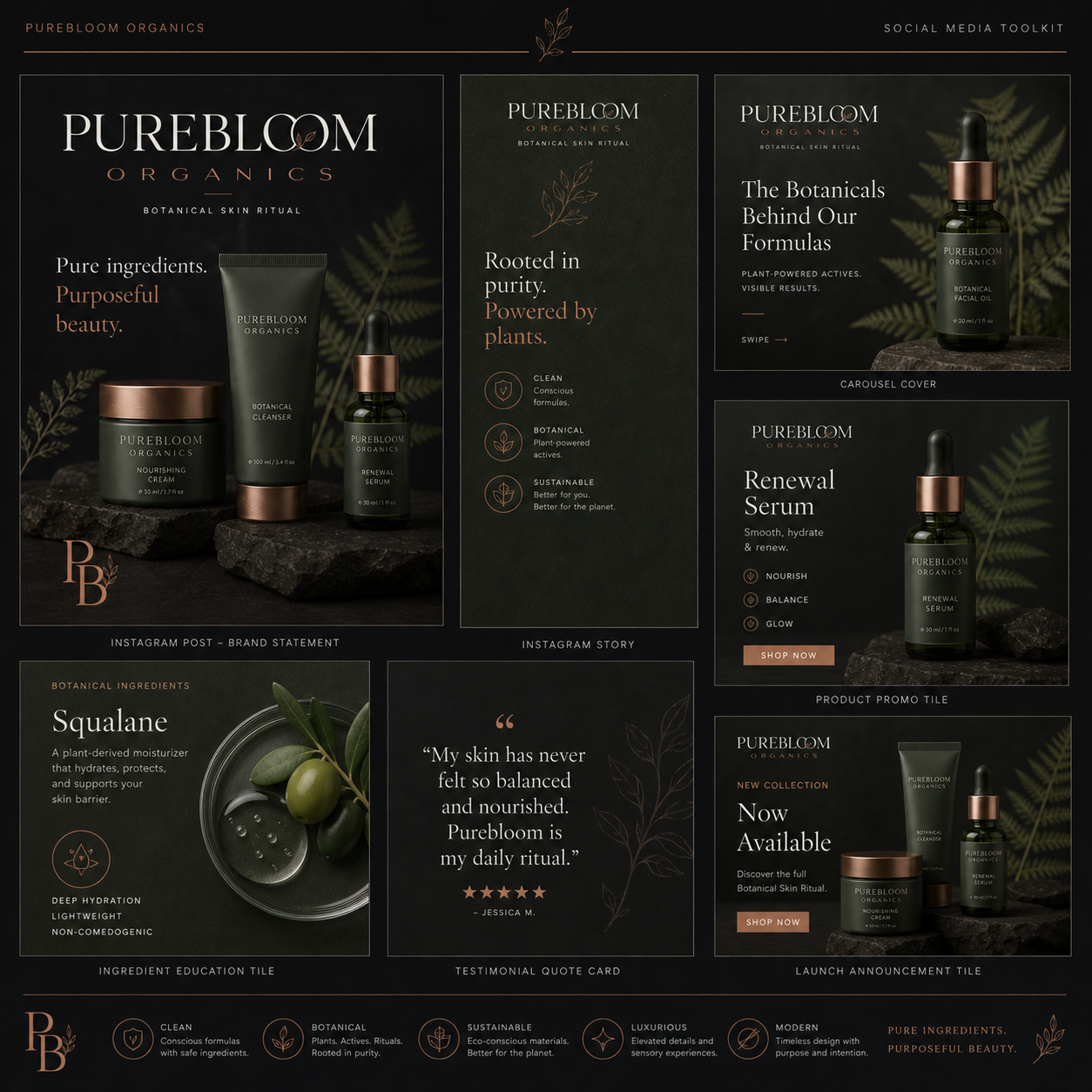
The social system is a cassette of templates — brand statement post, story, carousel cover, product promo, ingredient education, testimonial, launch announcement — so the team can ship on-brand content in minutes without art-direction every frame.
COMMERCE
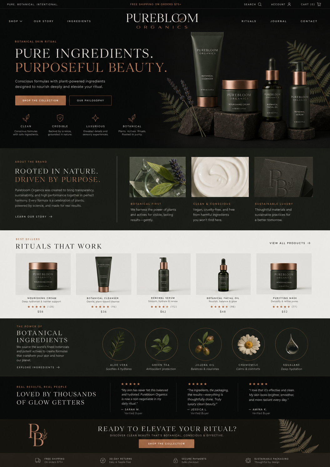
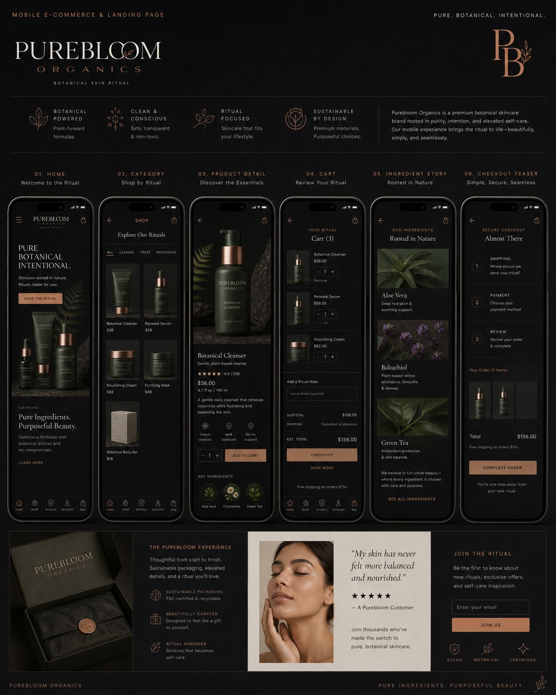
The e-commerce direction translates the packaging architecture into a merchandising story — a hero product still life, a "Rituals That Work" best-seller shelf, an ingredient education module, and a verified-buyer review wall. The mobile commerce flow uses six screens: home → category → product → cart → ingredient story → secure checkout, with one primary action and the required product context kept close to the decision.
RETAIL
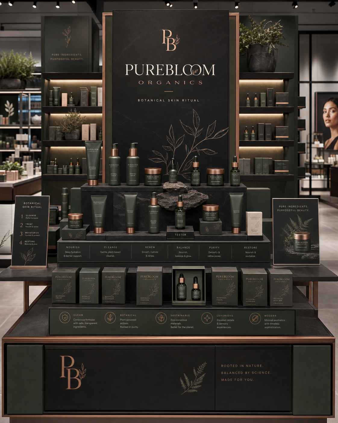
The retail tower turns the brand's six-pillar attribute system — Clean, Botanical, Sustainable, Luxurious, Modern, Credible — into a guided ritual that walks customers from cleanse → treat → moisturize → restore. The fixture is built to live inside a specialty beauty retailer and hold its own next to category leaders ten times its size.
OUTCOMES
NEXT ARCHIVE
LUXURA HAIR CARE