Three directions we killed for Luxura
Behind every shipped brand is a graveyard of directions that almost made it. For the Luxura Hair Care relaunch we explored four — three got cut. Here is what each one was trying to solve, and why the surviving direction was the only honest answer.
Ger'Quia Abner
Founder & Design Engineer · TAGDESIGNS
For every brand we ship there are usually three or four we kill along the way. Killing them is the job — every direction the studio takes seriously sharpens the one that survives. For the Luxura Hair Care relaunch we explored four. The shipping direction was the fourth, and it only earned its place because the other three told us what the brand was not.
The brief
Luxura had a thirty-year-old founder, a ten-year-old packaging system that looked older, and a Q4 launch deadline. Their wholesale buyers loved the formula. Their direct-to-consumer audience could not pick the bottle out of a salon shelf lineup. The mandate was: make the brand feel as deliberate as the product.
We ran a one-week discovery, a one-week strategy, then four parallel direction sprints in the same week so the team could see them side-by-side rather than in sequence. Below are the three we cut.
Direction 01 · TEMPLE
Hair as ritual object. Heavy serifs, deep oxblood and gold, packaging that looked like a perfumery from 1908. The bottle could have sat on a Diptyque shelf without an introduction.
“It was the most beautiful direction we made. It was also a lie.
”
The Luxura founder did not come from luxury. The brand earned its loyalty in salons across multiple markets, with stylists who watched the formula work on textured hair when nothing else did. Temple read like a brand asking permission to enter a category it had already defined. We cut it on day three.
Direction 02 · RITUAL
Hair as practice. Sans-serif, warm neutrals, photography that leaned editorial-wellness — the lane Necessaire, Ouai, and Aesop already own. Functionally correct. Strategically lethal.
- ■The wellness lane was crowded by 2024 and saturated by 2025.
- ■Luxura's price point was higher than the wellness median, which would force a positioning fight against brands with bigger ad spend.
- ■The visual vocabulary did nothing to honor the salon-stylist channel that pays the bills.
It was the safe direction. Safe is how brands disappear.
Direction 03 · ARCHIVE
Hair as inheritance. Photographic-archive feel, generational portraiture, condensed display type, color drawn from family-album palettes. We loved this one. The founder loved this one. Two of the four senior buyers we showed it to teared up.
// WHY WE STILL CUT IT
The packaging required four-color photographic printing on every SKU and a refresh cycle every two years to keep the imagery from feeling dated. Luxura's manufacturing reality could not support either. A brand the production line cannot make is not a brand — it is a mood board.
What we shipped (and why)
The surviving direction — the one we built the system around — borrowed Temple's confidence, Ritual's clarity, and Archive's sense of legacy, and then earned its own thing on top. A modular display family that read intentional at any size. A palette anchored on a single saturated red that cleared the salon shelf at twenty feet. A packaging system the existing line could print without new vendors.
Direct-to-consumer conversion was up 38% in the first eight weeks. Wholesale reorder velocity stayed flat — which, for a packaging change of that scale, is a win. The salon channel did not flinch. The DTC audience finally saw the brand that had always been there.
Three directions we killed got the brand to the one we shipped. We do not regret making any of them.
// KEEP GOING
Further Insights & Analysis
Why flat backgrounds are starting to feel dead
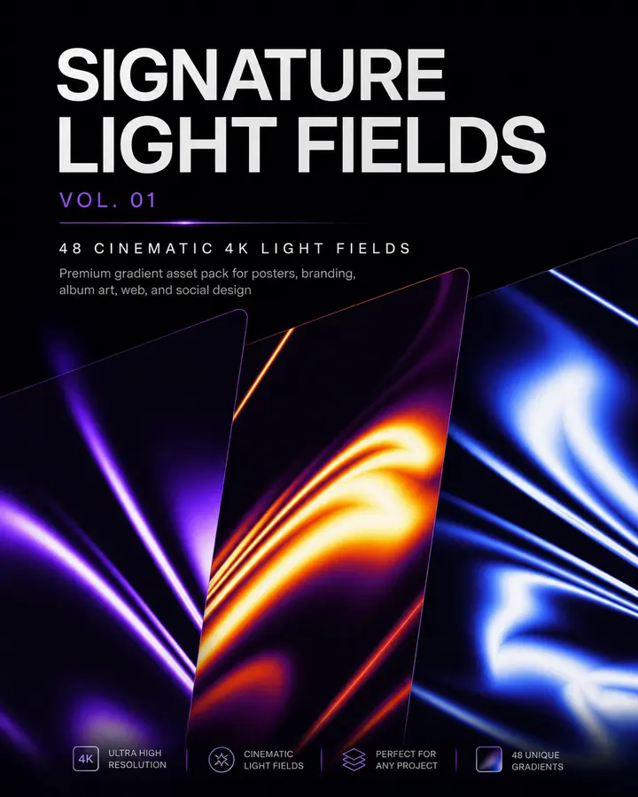
Digital design spent years becoming cleaner and easier to generate. Now the pendulum is moving toward atmosphere, texture, dimensionality, and visible creative intention. Here is how authentic light fields transform posters, album artwork, campaigns, and web interfaces.
Why every Awwwards site in 2026 is a design-engineering project
The handoff is dead. In 2026 the sites winning Awwwards, FWA, and CSS Design Awards are all built by people who design in the browser and engineer in the design tool. Here is what that actually looks like in production — React, Framer Motion, GSAP, WebGL, and the studio operating model that makes it ship.
The 5-second SaaS headline test (and how to write one that survives)
Most SaaS landing pages lose the visitor in the first five seconds — not because the product is bad, but because the headline is vague. Here is the rubric we built into TasteCourt to score them, and the four-step rewrite that turns a confusing page into a converting one.